Welcome back! In the previous part of this article we showed how to build some MongoDB Stitch functions which could automatically retrieve invoice data using the MongoDB Atlas API and store this data in a MongoDB Atlas cluster. In this, the second and concluding part of our article, we will look at how we can visualise this invoice data in a real-time dashboard using MongoDB Charts.
But before we look at building the Dashboard we’re going to need a way to translate some of the data provided by the invoice API's into a more human readable form.
Setting up a View in MongoDB
As with many APIs the raw data that's provided by the MongoDB Atlas API for invoice data isn't quite consumable or human friendly, e.g., it references Atlas Project by ID rather than by name. Thankfully this is a simple problem to solve - we can just use a MongoDB View to expose the data in a more convenient manner, so let's do that now.
The easiest way to create this View is to log in to the cluster using the MongoDB Shell (this is available from the MongoDB Downloads page if not already installed on your local machine.)
In order to log in to your cluster you will need to:
- Ensure the local machine is whitelisted in the Atlas project.
- Have access to a suitable user (per the setup instructions in part one of this article).
- Know the 'connection string' for the cluster.
IP Whitelist
To enable access to this cluster from the local machine we will add a suitable IP Whitelist entry. This can be achieved from the main MongoDB Atlas project page by navigating to the Security tab and selecting 'IP Whitelist'. Next click the green 'Add IP Address' button. This dialog will appear:
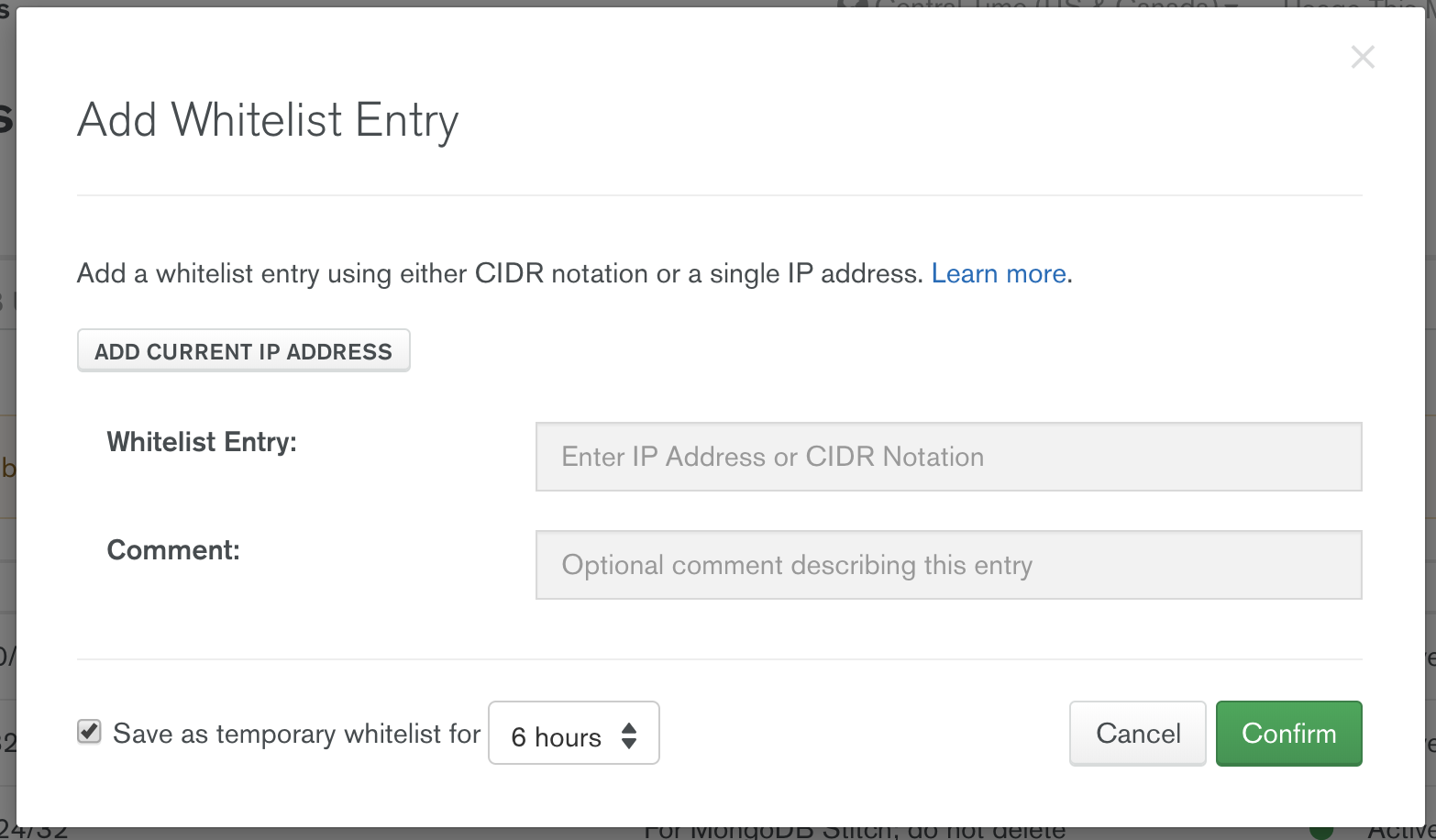
Select 'Add Current IP Address'. Add a comment and/or click the 'Save as temporary whitelist' if required and then click the green 'Confirm' button.
Connection String
To retrieve the connection string for your cluster, navigate back to the Project view in Atlas and click the 'Connect' button for your 'M0' cluster. Select 'Connect with the Mongo Shell' from the dialog and follow the instructions from there, selecting the version of the shell you have installed.
Creating the View
Connect to your MongoDB cluster using the connection string and user-credentials from above, e.g.:
mongo "mongodb+srv://<clustername>.mongodb.net/test" --username <username>Once connected issue the following commands to create the required View:
use billing;

var stage1 = { $unwind: { path: "$lineItems" }};

var stage2 = { $lookup: {
  from: 'projectdata',
  localField: 'lineItems.groupId',
  foreignField: 'id',
  as: 'result'
}};

var stage3 = { $project: {
  _id: 0,
  project: {"$cond": [{$eq:[{$size:"$result"},0]}, "$lineItems.groupId", "$result.name"]},
  date: { "$dateFromString": { dateString: "$lineItems.startDate" }},
  sku: "$lineItems.sku",
  cost: { "$toDecimal": { "$divide": [ "$lineItems.totalPriceCents", 100 ]}},
  details: "$lineItems",
}};

var stage4 = { $unwind: { path: "$project" }};

db.createView("details", "billingdata", [stage1, stage2, stage3, stage4]);
To make this easier to understand we've defined each aggregation pipeline stage in separate variables, which we then pass into the 'createView' function. This pipeline is broken into the following stages:
- Uses an
'$unwind'stage to unwind the'lineItems'array in each billing document into separate documents for further processing. - Joins the resulting documents (via the
'$lookup'stage) with those in the'projectdata'collection by matching the'lineItems.groupId'field to the'id'field in the'projectdata'documents. - Uses a projection stage, i.e.,
'$project', to:- Remove the
'_id'field. - Promote the
'result.name'field to a top level field called'project'(as in the Atlas project name - not to be confused with the'$project', aka projection, stage). Note that if we are retrieving historic billing data and the project no longer exists, we won't have a'result.name'field so we default to using the'lineItems.groupId'field instead. - Convert the
'lineItems.startDate'string field to a top-levelISODatefield called'date'. - Promote the
'lineItems.sku'field to a top level field. - Calculate a
'totalPrice'field (in USD rather than cents). - Pass through the
'lineItems'field, renaming it to'details'.
- Remove the
- Uses a final
'$unwind'stage to unwind the new'project'field (from above it contains just a single subdocument containing the project name so this stage effectively turns our 1-element array into a simple field value).
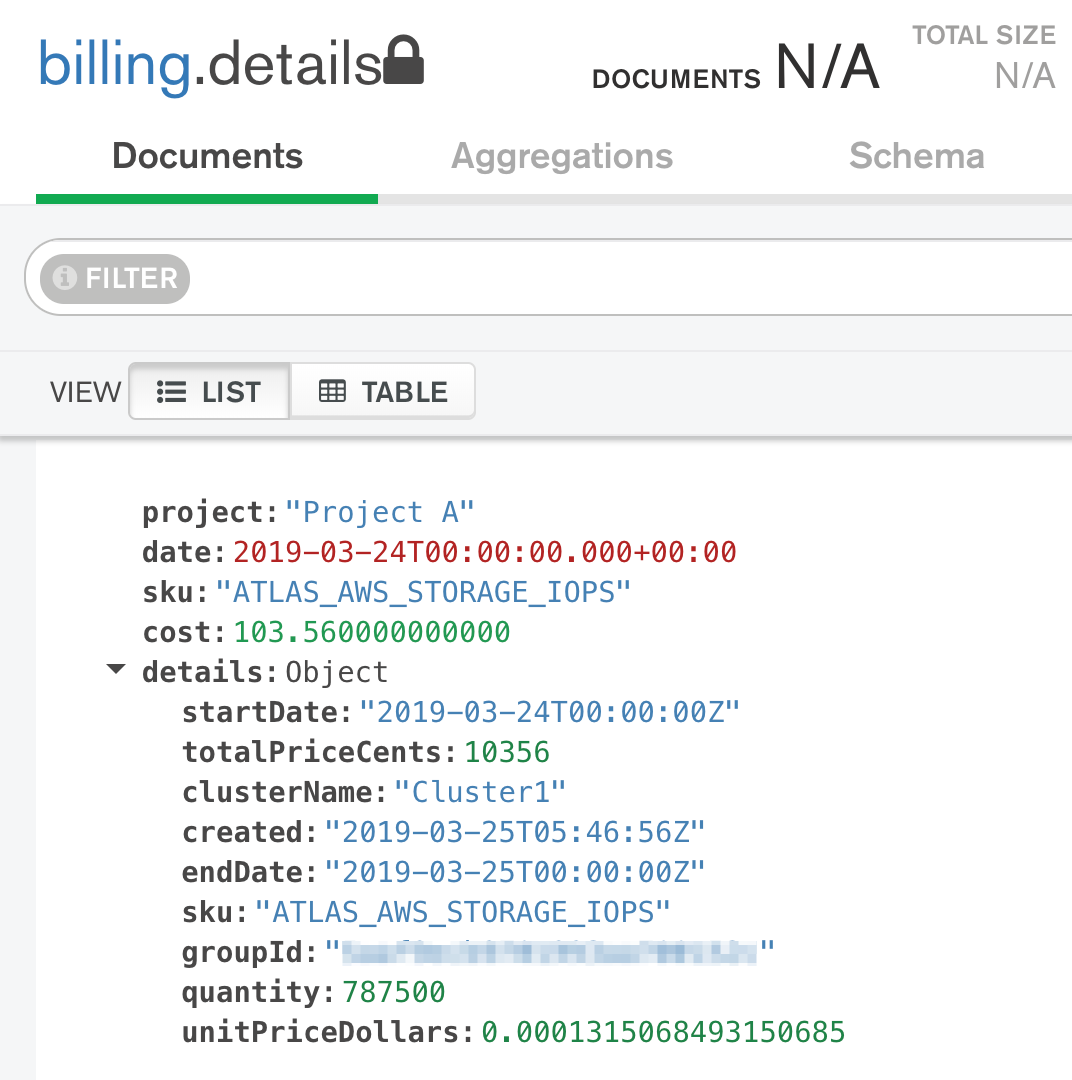
Once created you can see the new View in the 'Collections' tab for your Atlas cluster. It will look like any other collection there, but the documents within it will have been created with our view code and look something like this in MongoDB Compass:
Creating a Dashboard
At this point we have our data available in a form we can use to create our Billing Dashboard!
To build the Dashboard navigate to 'Charts' on the left navigation bar in your Atlas project and click the green 'Activate MongoDB Charts' button.
Once activated you will need to create a 'Data Source' to provide data to the dashboard.
Creating a Data Source
- Navigate to the
'Data Sources'tab and click the green'New Data Source'button per the following image:

- Select your Altas cluster in the dialog that appears and click the green
'Connect'button. - Once connected select the
'details'collection in the'billing'database, then click the green'Set Permissions'button. - Optional: Modify the permissions if you wish to grant others
'manager'or'owner'rights for your dashboard. - Once complete click the green
'Publish Data Source'button.
Building the Dashboard
We can now actually create the dashboard. Navigate back to the 'Dashboards' tab if necessary and then click the green 'New Dashboard' button. Provide a 'Title' and 'Description' as required before clicking the green 'Create' button.
Building the Charts
Inside our new dashboard we can create several Charts.
For each chart:
- Click on the green
'Add Chart'button.

- Select the
'billing.details'as the data source from the'Data Source'dropdown.
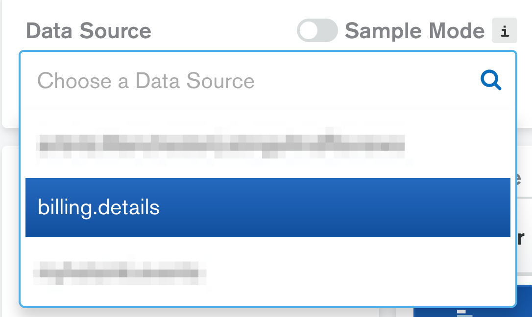
- Construct each chart using the fields exposed via this data source and supply an appropriate title. See below for some sample charts.
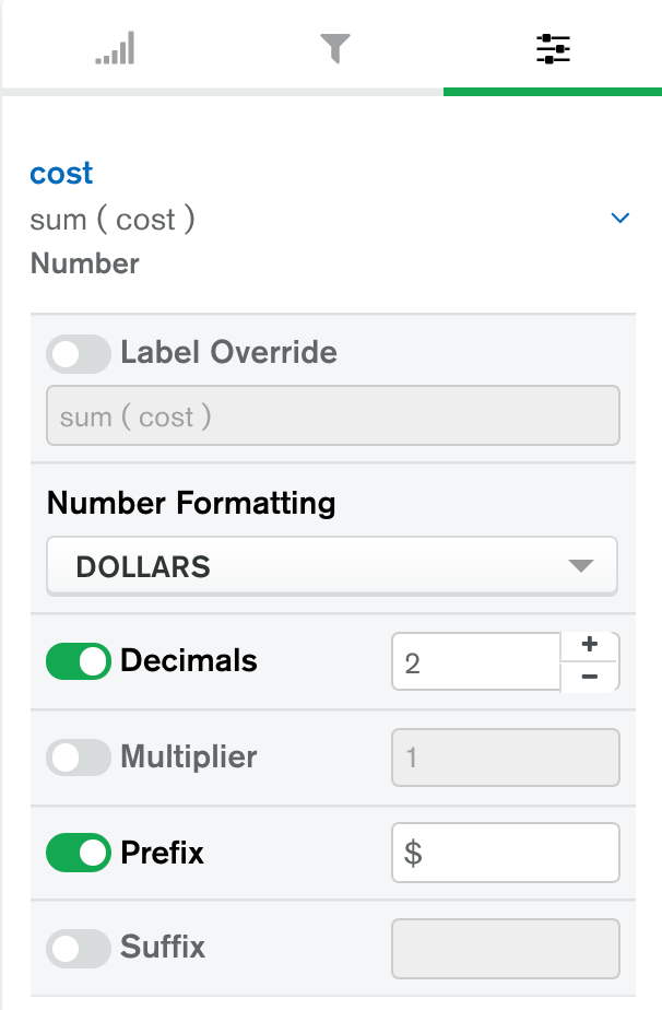
- Optional: When using the
'cost'field in any chart switch to the'Customization'tab and change the'Number Formatting'option to'Dollars'.
- Once the chart is complete, click the green
'Save and Close'button. - In the Dashboard you can now view, move, and resize the Chart as you wish.
To ensure the Dashboard remains up-to-date make sure the 'Auto Refresh' button in the Dashboard view is set to 'AUTO'. Adjust the refresh settings from the dropdown as appropriate, e.g. refresh every 5 minutes.
Sample Charts
In this section we present a number of sample Charts that you can create for this Dashboard.
Chart 1: Total Spend
This chart shows the total spend since the invoice data was first collected.
- Create a new Chart.
- Select the
'Text'Chart Type. - Select the
'Number'option. - Drag the
'cost'field over to'Number', setting the'Aggregate'to'Sum'. - Save the new chart.

Chart 2: Total Spend (last 7 days)
Using the new 'Filter' option it is easy to modify this chart to show the total spend over a period of time. For example, to create a new chart showing the spend over the last week proceed as follows:
- Duplicate the previous Chart.
- Switch to the
'Filter'tab (middle tab of three under the'Chart Type'component). - Drag the
'date'field over to'Chart Filters'. - Select
'Relative'. - Enable the
'From'option and enter'8'in the central text input box. The result should look like this:
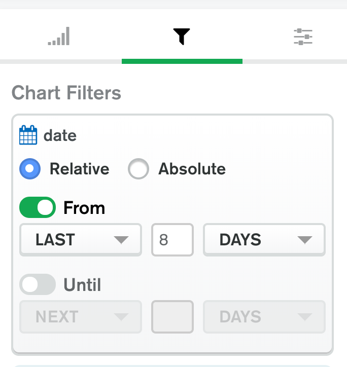
Note: Given that our invoice data is only collected once per day (at 6:15am) we use '8' rather than '7' to ensure we span the last 7 full days.
- Save the new chart.
Chart 3: Biggest Spenders
This chart shows the total spend per project. The data for each project will be stacked by SKU.
- Create a new Chart.
- Select
'Bar'chart. - Select
'Stacked'option. - Drag the
'cost'field over to'X Axis', setting the'Aggregate'to'Sum'. - Drag the
'project'field over to'Y Axis', sorting by'Value'(descending). - Drag the
'sku'field over to'Series'. - Save the new chart.

Chart 4: Biggest Spenders (last 7 days)
To create a new chart showing the same data over the last week proceed as follows:
- Duplicate the previous Chart.
- Switch to the
'Filter'tab. - Drag the
'date'field over to'Chart Filters'. - Select
'Relative'. - Enable the
'From'option and enter'8'in the central text input box. - Save the new chart.
Chart 5: Top 10 Days Ranked by Spend
This chart ranks the days by spend showing the top 10 and stacked by project. This graph is a little different to some of the others in that we will be using the 'details.startDate' field which is a string representation of the toplevel date field. This will allow us to sort and limit the results, which is not currently possible in MongoDB Charts with an ISODate field.
Create a new Chart.
Enter the following into the
'Query'field at the top to reshape our documents and click the green'Apply'button on the right hand side:[{$project: {"cost":1, "project":1, "date": {"$split": ["$details.startDate", "T"]}}}]This uses an aggregation pipeline (specifically a single
'$project'stage) to pass through the'cost'and'project'fields and to expose the'details.startDate'field as a new top level'date'field (effectively replacing the original top level'date'field). These are the 3 fields we will use in our chart. Note our use of the'$split'operator which we use to split the date field (which is a string field) in two using the letter'T'as the delimiter. The result is that the new top level'date'field is an array containing 2 elements, the first is the date component (which we will use) and the second is the time component (which we will discard). And now to build the chart...Select
'Column'chart.Select
'Stacked'option.Drag the new
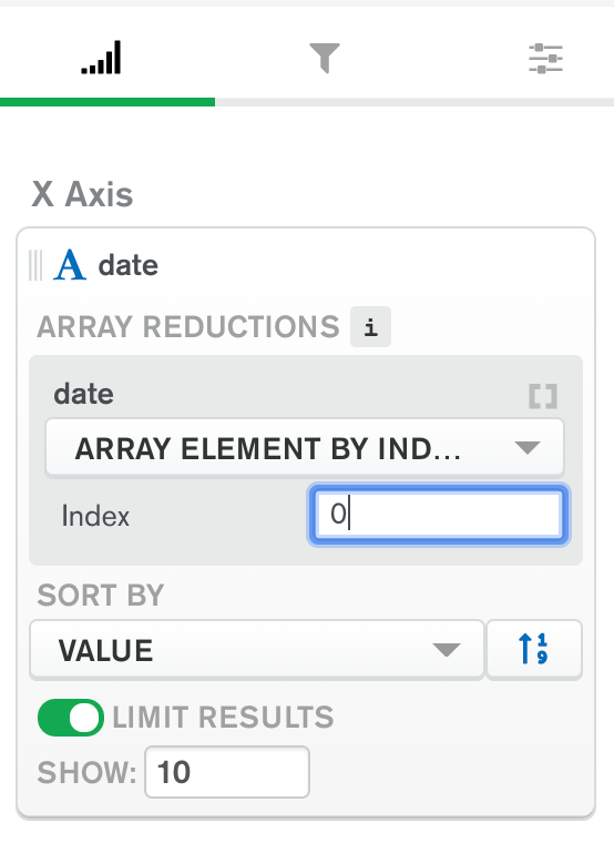
'date'field over to'X Axis'. As this is an array field we need to specify a few additional options:- Select
'Array element by index'for the'Array Reductions'option. - Select
'0'as the'Index'. - Sort by
'Value'(descending). - Set the limit the results to
'10'.
- Select
- Drag the
'cost'field over to'Y Axis', setting the'Aggregate'to'Sum'. - Drag the
'project'field over to'Series'. - Save the new chart.

Chart 6: Spend / Day (last 7 days)
This chart is similar to the previous graph but shows the total cost over the preceding 7 days stacked by project, rather than ranking the days based on total spend.
Create a new Chart.
Select
'Column'chart.Select
'Stacked'option.Drag the
'date'field over to'X Axis'and turn off'Binning'by clicking the rocker switch.Drag the
'cost'field over to'Y Axis', setting the'Aggregate'to'Sum'.Drag the
'project'field over to'Series'.Next switch to the
'Filter'tab.Drag the
'date'field over to'Chart Filters'.Select
'Relative'.Enable the
'From'option and enter'8'in the central text input box.Optional: Change the
'date'format in the'Customization'tab to match the format in the previous chart.Save the new chart.
![Spend per day for the last 7 days]()
Chart 7: Big Spenders by SKU
This chart shows a heat map, plotting Projects against SKUs, i.e., it shows which SKUs are consuming the most on a per-project basis.
- Create a new Chart.
- Select
'Grid'chart. - Select
'Heatmap'option. - Drag the
'sku'field over to'X Axis', sorting by'Category'ascending. - Drag the
'project'field over to'Y Axis'. - Drag the
'cost'field over to'Intensity', setting the'Aggregate'to'Sum'. - Optional: Change the colour palette in the
'Customization'tab. - Save the new chart.

Chart 8: Big Spenders by SKU (last 7 days)
This chart shows a heat map, plotting Projects against SKUs, for the last 7 days.
- Duplicate the previous Chart.
- Switch to the
'Filter'tab. - Drag the
'date'field over to'Chart Filters'. - Select
'Relative'. - Enable the
'From'option and enter'8'in the central text input box. - Optional: Change the colour palette in the
'Customization'tab. - Save the new chart.
Chart 9: Total Spend / Month
This chart shows the total spend on a monthly basis.
- Create a new Chart.
- Select
'Bar'chart. - Select
'Grouped'option. - Drag the
'cost'field over to'X Axis', setting the'Aggregate'to'Sum'. - Drag the
'date'field over to'Y Axis', turn on'Binning'and select'Month'. - Optional: Turn on
'Data Value Labels'in the'Customization'tab. - Save the new chart.

Chart 10: Total Spend / Day
This chart shows the total spend on a weekday basis, stacked by project.
Duplicate the previous chart.
Select the
'Stacked'option for the'Chart Type'.Change the
'Binning'option to'Day of the Week'and ensure'Periodic'is enabled.Drag the
'project'field over to'Series'.Save the new chart.
![Total Spend by Day for All Time]()
Insights from the Field
As I wrap up, I would like to bring you back to the original idea I had - it all stemmed from a conversation with an existing MongoDB customer who wanted to visualise their spend on MongoDB Atlas.
In order to implement the Billing Dashboard I've used a number of MongoDB tools and features along the way, such as MongoDB Atlas (including the Atlas API), MongoDB Stitch and MongoDB Charts. The sample Dashboard we ended up building made it easy to see Atlas spend in general and to identify the biggest spenders in a given Atlas Organization based on a number of criteria. And the best part? We were able to build this feature for free - we are able to store all our invoice data in a free M0 tier cluster in MongoDB Atlas and the MongoDB Stitch app usage easily fits within the MongoDB Stitch free tier too. This project has also had some interesting implications for me and my team...
For example, as I built out a Billing Dashboard to visualise my team's spend in Atlas I was able to identify some unusual spending patterns across the team. In one instance I noticed how a colleague was racking up a large daily bill even though they were on vacation. Digging in further I found they had left an M40 NVME cluster running by mistake. Once this was identified we were quickly able to shut the cluster down and prevent unnecessary costs being accrued in their absence.
In another instance I noticed our credit consumption was 20% higher than expected. Further investigation led to the realisation that we had forgotten to apply our company VAT number in the billing details for our Atlas Organization so we were being charged 20% more than our assumed monthly run-rate. For our friends in the US who might not know what VAT is, it's effectively a sales-tax here in the UK. Again this was easily addressed once we knew what the problem was - we simply applied the VAT number and our run rate reduced as expected.
I'm happy to report that the time I've invested in this project has paid many dividends and has helped everyone on my team keep their Atlas spend under control!
Conclusion
We've covered a lot of ground in this two-part article but before I finish I would like to leave you with some ideas on how to extend your Billing Dashboard:
- MongoDB recently introduced a new Hosting feature where you can host a static web page. Why not use that to publish a web page with some embedded charts? You can find some additional details in the following blog post: "This blog post has charts and yours could too!".
- The Atlas Invoice API returns other details which we didn't use, including a
'payments'array, a'refunds'array and a'salesTaxCents'field. Some of these may be useful to visualise (such as the payment info) or may impact the total spend for your organization if, for example, you have received a refund from MongoDB or are subject to US sales-tax. Incorporating these aspects into the workflow we've described above will help ensure the details shown in the final Dashboard are a more accurate reflection under these circumstances.
Finally, I hope you've found this article useful. Please feel free to leave a comment below describing any enhancements you have made to your own Dashboard or situations where this article has helped you visualise some data, whether it be Atlas spend related or otherwise. Happy Charting!

