Today at MongoDB World 2018 in New York, we are excited to announce the beta release of MongoDB Charts, available now.
MongoDB Charts is the fastest and easiest way to build visualizations of MongoDB data. Now you can easily build visualizations with an intuitive UI and analyze complex, nested data—like arrays and subdocuments—something other visualization technologies designed for tabular databases struggle with. Then assemble those visualizations into a dashboard for at-a-glance, up-to-the minute information. Dashboards can be shared with other users, either for collaboration or viewing only, so that entire groups and organizations can become data-driven and benefit from data visualizations and the insights they provide. When you connect to a live data source, MongoDB Charts will keep your charts and dashboards up to date with the most recent data.
Charts allows you to connect to any MongoDB instance on which you have access permissions, or use existing data sources that other Charts users share with you. With MongoDB’s workload isolation capabilities—enabling you to separate your operational from analytical workloads in the same cluster—you can use Charts for a real-time view without having any impact on production workloads.

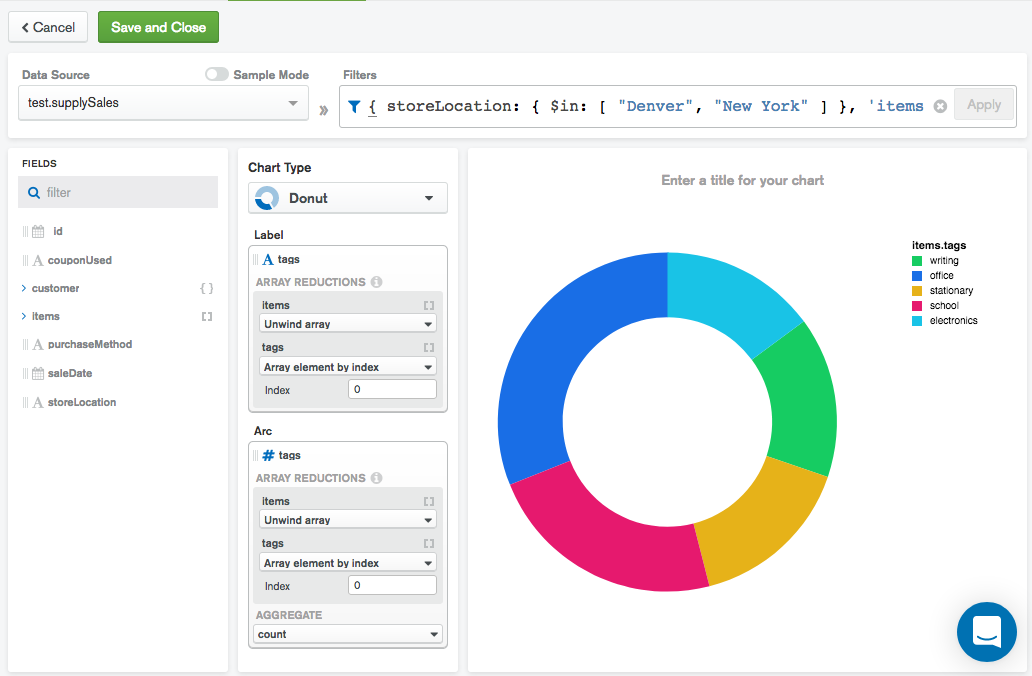
Unlike other visualization products, MongoDB Charts is designed to natively handle MongoDB’s rich data structures. MongoDB Charts makes it easy to visualize complex arrays and subdocuments without flattening the data or spending time and effort on ETL. Charts will automatically generate an aggregation pipeline from your chart design which is executed on your MongoDB server, giving you full access to the power of MongoDB when creating visualizations.

Charts already supports all common visualization types, including bar, column, line, area, scatter and donut charts, with table views and other advanced charts coming soon. Multiple visualizations can be assembled into dashboards, providing an at-a-glance understanding of all of your most important data. Dashboards can be used to track KPIs, understand trends, spot outliers and anomalies, and more.

Graphs and charts are a great way to communicate insights with others, but we know data can often be sensitive. Charts lets you stay in control over which users in your organization have access to your data sources and dashboards. You can choose to share with your entire organization, select individuals or keep things private to yourself. Dashboards can be shared as read-only or as read-write, depending on whether you want to communicate or collaborate.

Since this is a beta release, it’s free for anyone to try, but keep in mind that we may add or change functionality before the final release. MongoDB Charts is available as a Docker image which you can install on a server or VM within your environment. Once the Docker container is running, people in your organisation can access Charts from any desktop web browser. To download the image and get started with Charts, head to the MongoDB Download Center.
We think that MongoDB Charts is the best way to get quick, self-service visualizations of the data you’re storing in MongoDB. But we’re only just getting started. Once you try out the beta, please use the built-in feedback tool to report issues and to let us know what you do and don’t like, and we’ll use this input to make future releases even better.
Happy charting!
The development, release, and timing of any features or functionality described for our products remains at our sole discretion. This information is merely intended to outline our general product direction and it should not be relied on in making a purchasing decision nor is this a commitment, promise or legal obligation to deliver any material, code, or functionality.