MongoDB is excited to announce a few new updates to Atlas Charts that enable you to securely share insights, gain deeper visibility into expenses, and customize your most frequently used data visualizations.
Based on specific feedback received from users of our native visualization tool, these significant improvements will make data analysis even more productive. We:
-
Improved security in Atlas Charts for passcode-protected public dashboards
-
Increased visibility into Atlas spending through an updated billing dashboard
-
Introduced new customization for table charts through hyperlinks and hidden columns
Secure insights with passcode-protected public dashboards
First, there’s the new passcode-protected public dashboards feature that brings an extra layer of security to publicly shared dashboards—we understand that not everyone who benefits from Atlas Charts operates within MongoDB Atlas. Alongside the ability to schedule email reports and support for publicly-shared dashboards, we’re offering a new and secure way to spread insights with the launch of our latest feature. Add an extra layer of security to previously publicly shared dashboards, ensuring that only authorized users with the passcode can access your data.
Enabling passcode protection on a dashboard is simple. As a dashboard owner, a new option is available to protect dashboard links with a passcode when sharing it publicly.
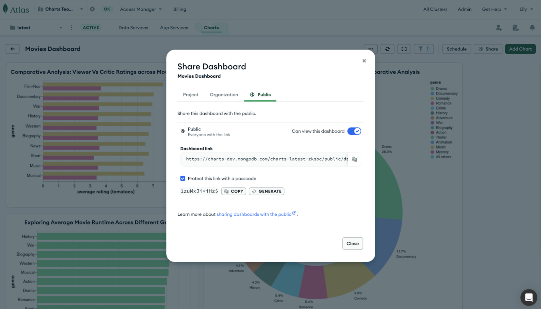
Once enabled, a passcode is automatically generated and can be copied to the clipboard (and regenerated on demand as needed).
Viewers navigating to dashboards via the public link will see a new screen prompting them to enter a passcode. Once authenticated successfully, they can view the dashboard just as before.
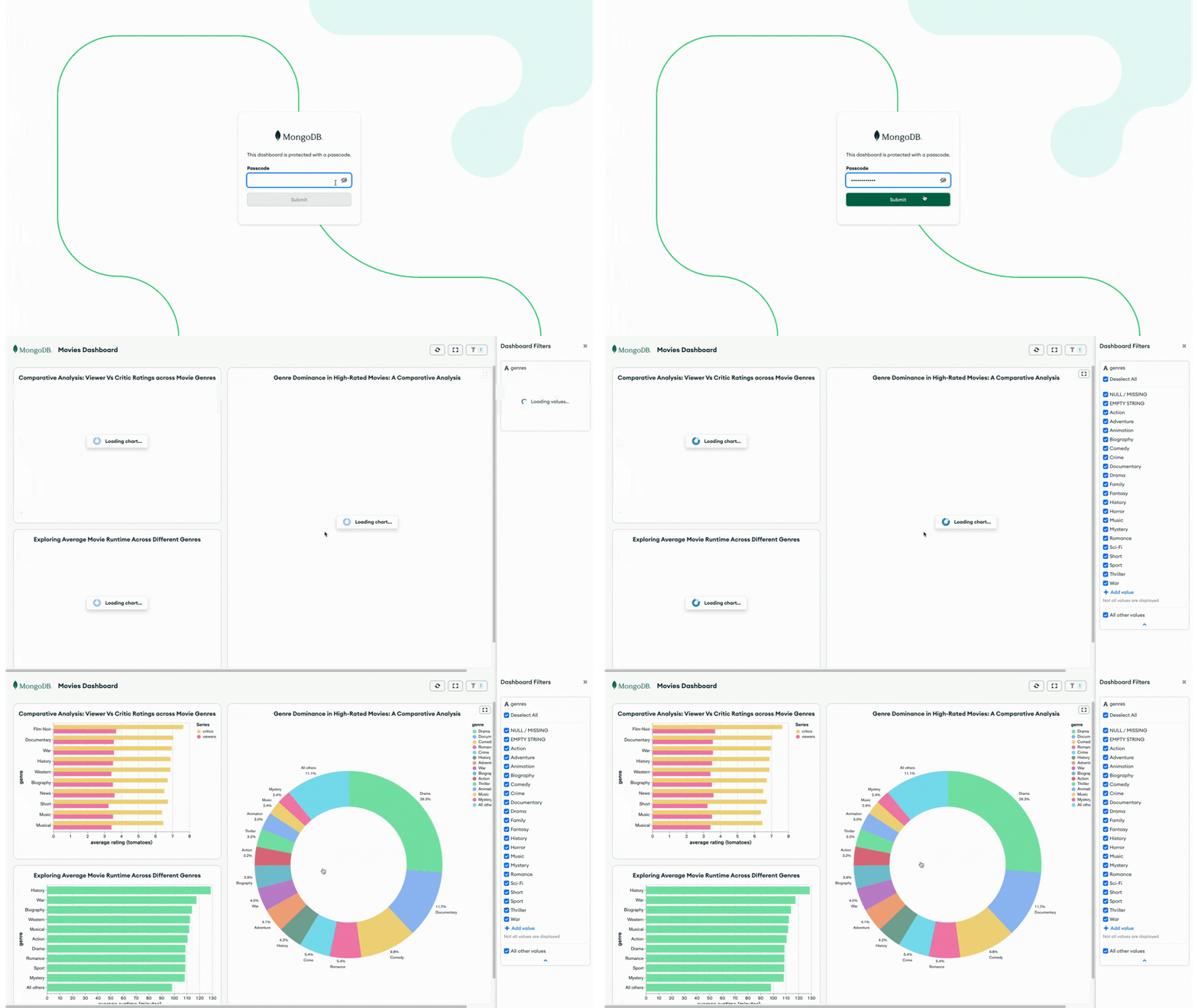
Whether you're sharing insights with clients, stakeholders, or team members, rest assured that your data remains easily accessible yet secure. To learn more about the different ways we support dashboard sharing, check out our documentation.
What’s new in the Atlas Charts billing dashboard
Next, we continue to make enhancements to the MongoDB Atlas Charts billing dashboard, all of which provide insights into Atlas expenses. We are delighted to share that it’s now possible to see resource tags data, as well as billing data from all linked organizations inside the Atlas Charts billing dashboard. Additionally, users can now ingest billing data from another organization, provided they possess the organization’s API keys.
These newly introduced features rely on the availability of billing data within the organization. And for those leveraging resource tags, the billing data will seamlessly integrate, empowering users to generate personalized charts or to incorporate tailored dashboard filters within the Atlas Charts billing dashboard.
If cross-organization billing is enabled, editing the configuration will ingest the linked organization’s billing data for the last three months, with the option to extend this period to up to a year by creating a new ingestion.
Project tags data in the Atlas Charts billing dashboard
Resource tags are now seamlessly integrated into billing data and can be included in any of the charts or the dashboard filters inside the Atlas billing dashboard.
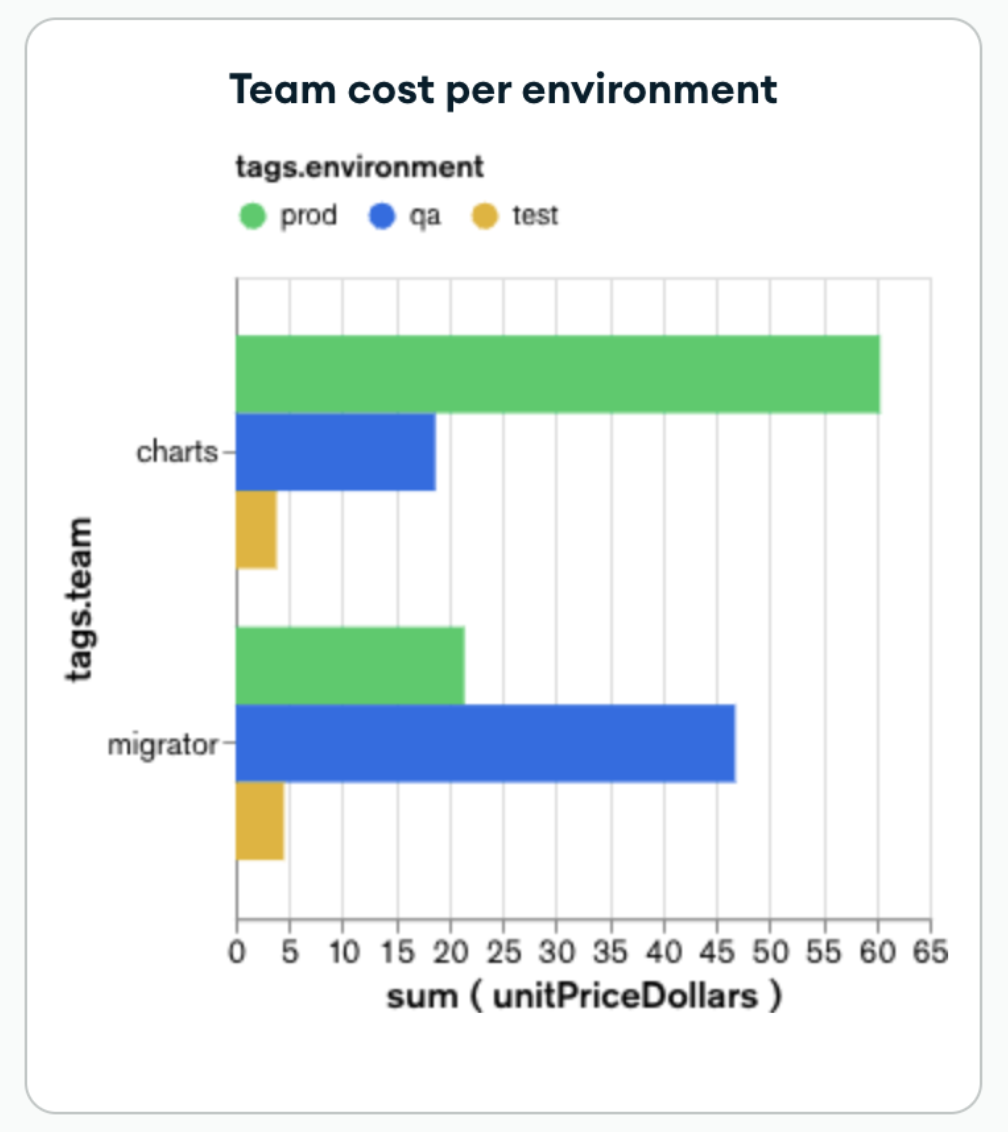
For example, our MongoDB organization uses the Atlas auto-suggested tags “application” and “environment,” alongside a custom resource tag labeled "team." The following chart uses the tags data and shows the billing cost per team and per environment.
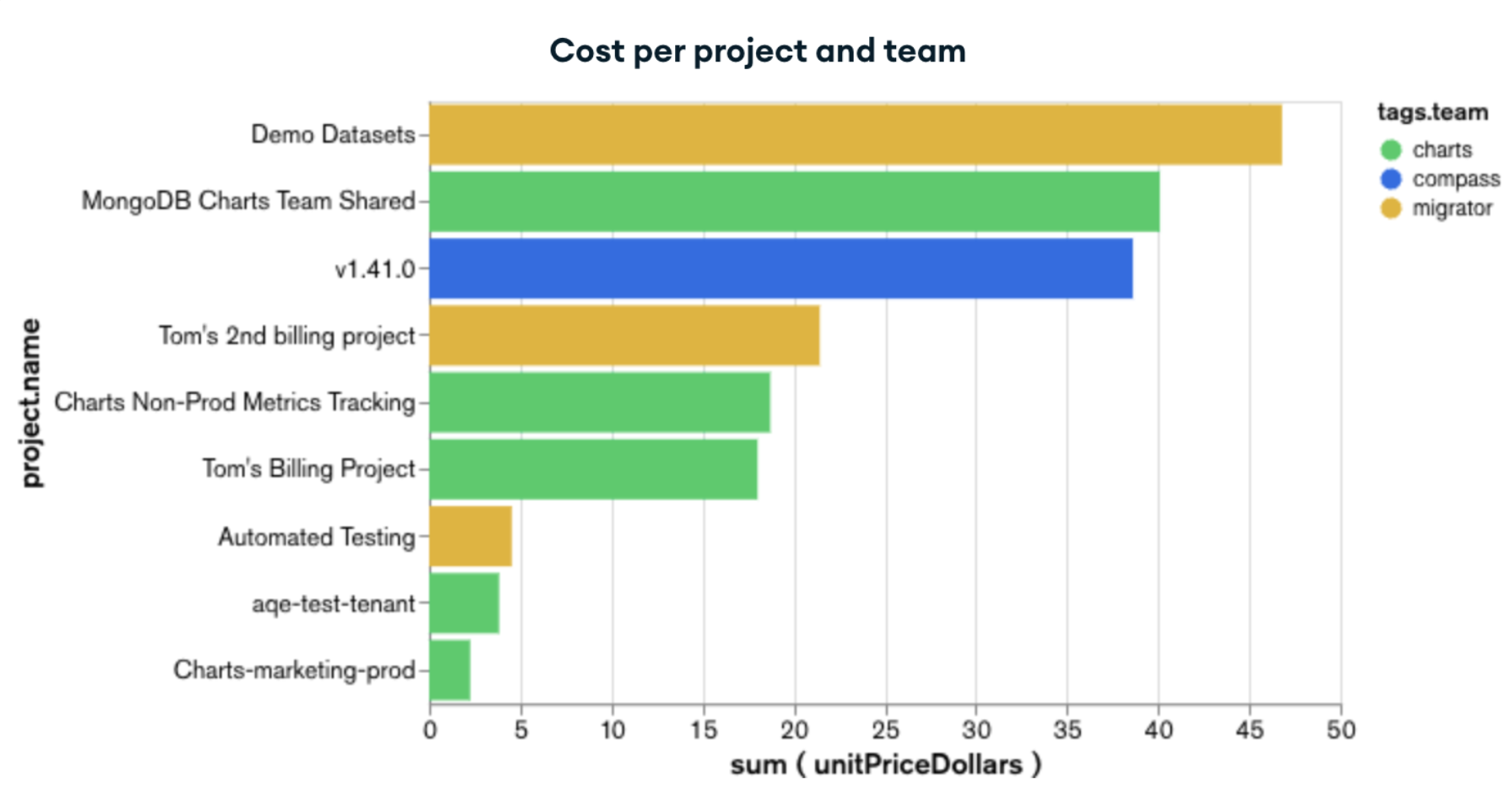
The subsequent chart presents the billing cost allocated per project and team, providing valuable insights into the primary cost drivers for each team's projects.
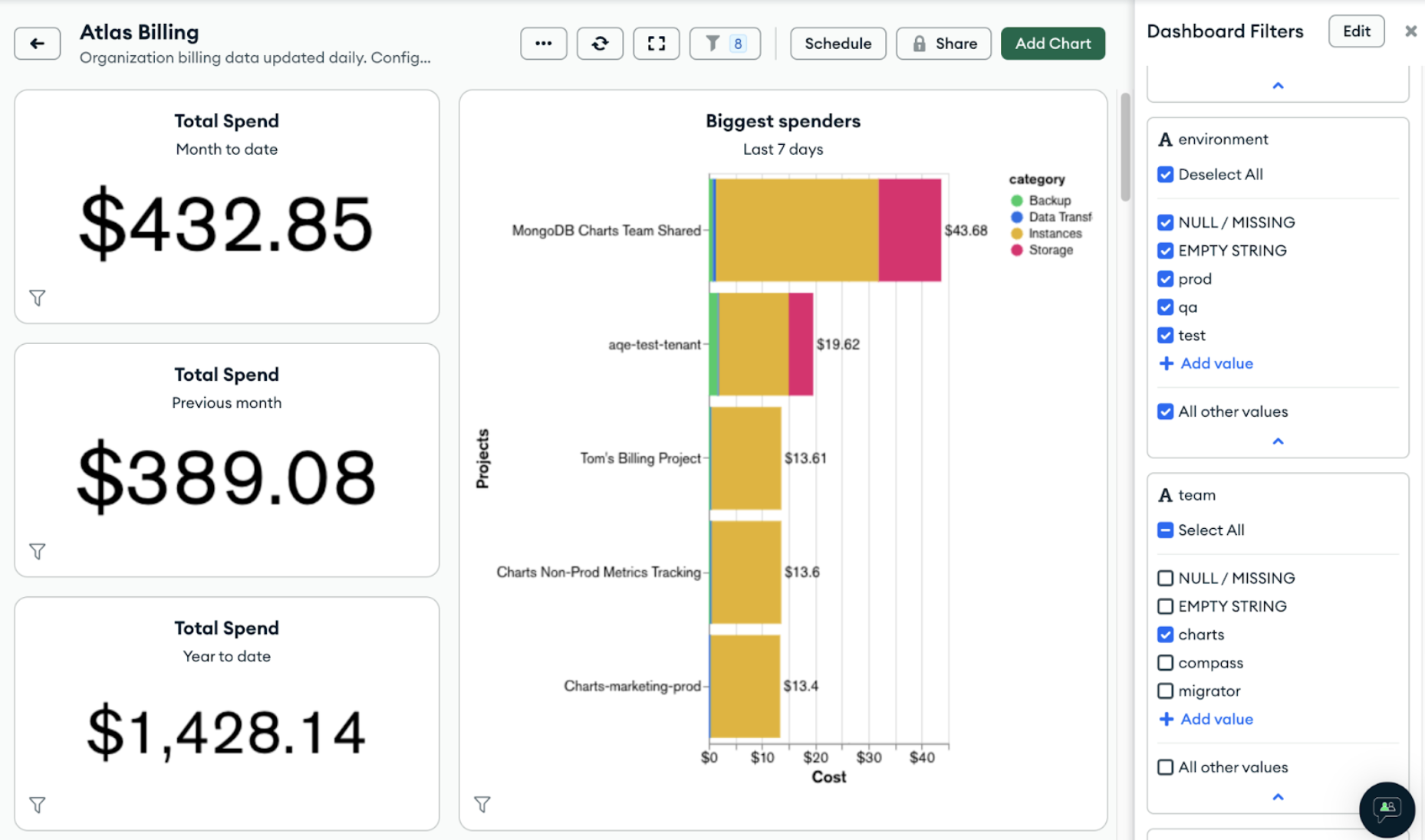
Users can also add a dashboard filter to the “tags” field, which will allow them to see the whole dashboard based on the selected tag values.
In the next example, we have selected a specific “team” : “Charts” from the tags dashboard filter, so we can see all of the billing insights per team thanks to our custom tag.
Linked organization’s data in the Atlas Charts billing dashboard
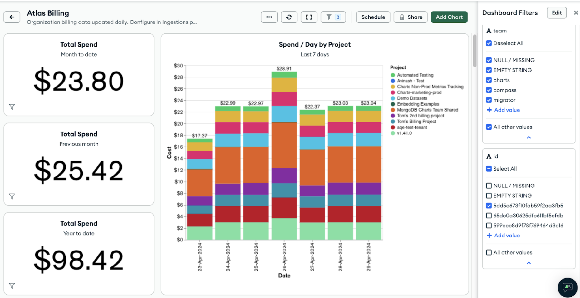
For complex Atlas projects spanning multiple organizations, the Atlas Charts billing dashboard now seamlessly integrates billing data from all linked organizations. The most productive use case is to add a dashboard filter based on the "organizationId" to enable filtering data according to specific organizations for a more granular analysis of the spending.
Billing data from another organization
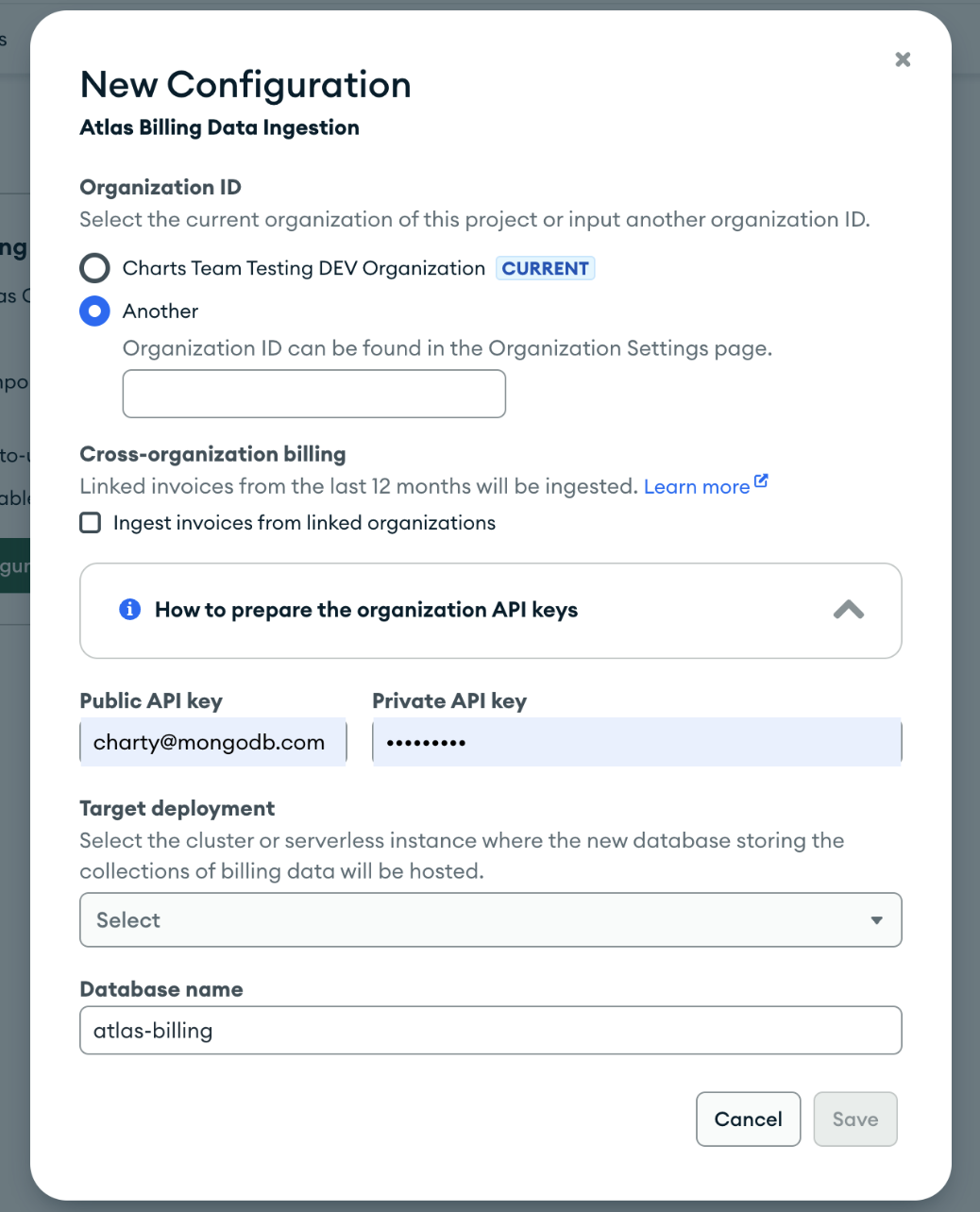
Users can now ingest billing data from other organizations that are not directly linked, provided they possess authorization API keys, bringing the data you need to where you are.
These new features in the Atlas Charts billing dashboard are designed to provide richer, more detailed insights into organization spend. Check out our documentation and our previous blog post to learn more about it.
Hyperlinks and hidden columns for tables in Atlas Charts
Of all the data visualization methods available in Atlas Charts, table charts rank as one of the most popular among our users. So it should come as no surprise that one of the most highly requested features from our customers is the ability to format columnar data as hyperlinks.
We're excited to announce that this is now possible in Atlas Charts through the new hyperlink customization options available for table charts.
With hyperlink customization, you can format columnar data as hyperlinks using any of the following URI protocols: http, https, mailto, or tel, and can be constructed statically or dynamically using encoded fields.
Let’s assume we’ve created a table using the sample movies dataset in Atlas, with encodings like title, imdb.id, runtime, genre, poster_display—which is a calculated field—and more.
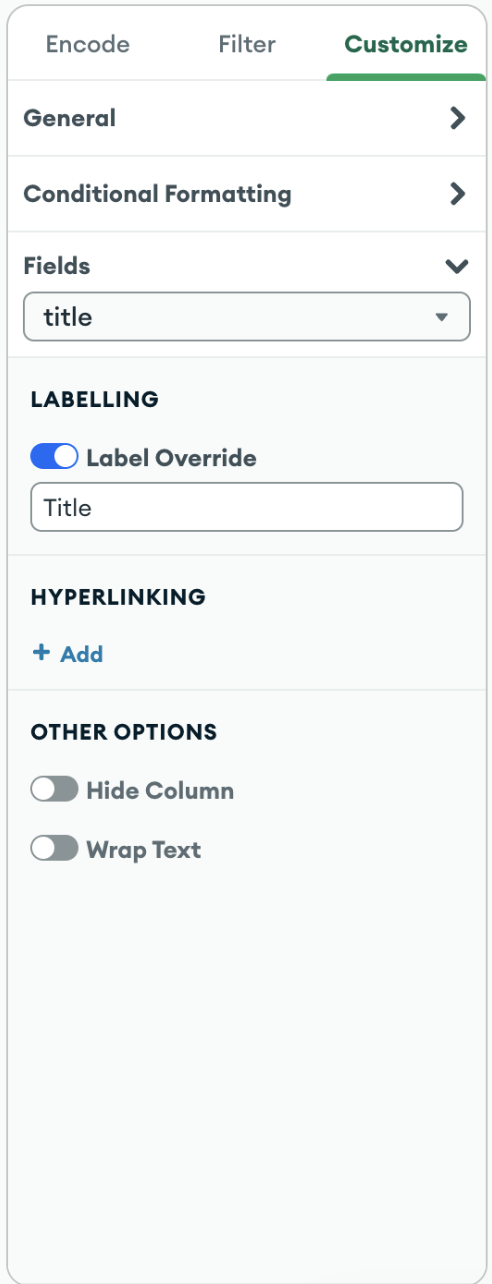
To turn movie titles into clickable links that direct users to their respective IMDB pages, navigate to the customization panel and click into the hyperlinking feature in the fields tab.
We will format the title field as a hyperlink which links to the Internet Movie Database (IMDB) entry for that movie. IMDB URLs are formatted as follows, where id needs to be substituted with the value of the imdb.id field for each document.
https://www.imdb.com/title/tt<id>/
Customize the “title” field in the table chart to link to IMDB using the “imdb.id” field in the URI input.
Below, a preview displays the fully formatted URI with fields substituted for their values, helping to ensure it’s correct before we save it to be applied to the chart.
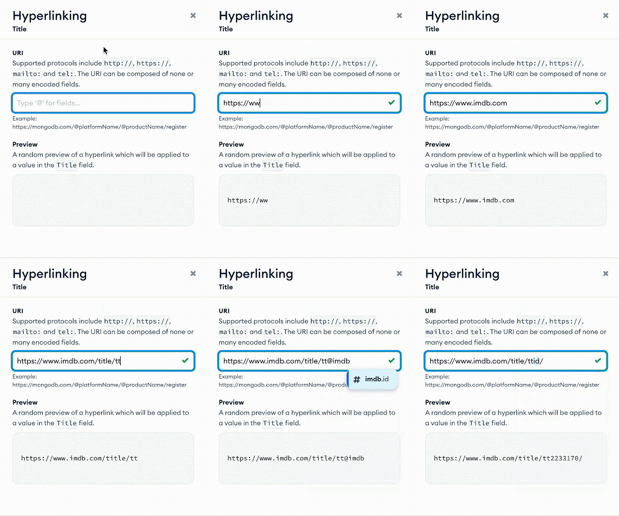
Since we only need the imdb.id field to be encoded for the purpose of constructing the URI applied to the title field, we can hide the column from rendering using another new customization option.
Select the imdb.id field in the customization panel, and toggle on the “Hide Column” option.
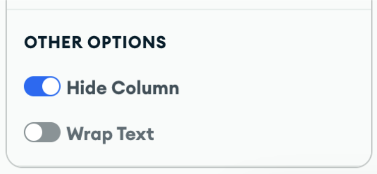
We also support using URI values directly from fields (provided they use one of the supported protocols). Let’s see this in action by creating a hyperlink to the movie poster.
In the URI input, trigger the encoded field menu using the @ keyboard shortcut, and select the poster field.
Similar to the previous example, a preview will be displayed. After saving and applying the hyperlink formatting, we can hide the rendering of the poster field as needed to keep the chart clean.
-hz7iaz0sbp.gif)
All these options are accessible in the customization panel, making it straightforward to enhance table charts with interactive hyperlinks. For more detailed instructions, visit our documentation.
As we conclude this roundup, we hope you’re as excited about these updates as we are. The Atlas Charts team is dedicated to continuously improving Atlas Charts to meet your needs and enhance your data visualization experience. Stay tuned for more updates, and happy charting!
New to Atlas Charts? Get started today by logging into or signing up for MongoDB Atlas, deploying or selecting a cluster, and activating Charts for free.