Colours are integral to the story you want to convey with any sort of data visualisation. With the latest release of MongoDB Charts, we have added more control to how you can assign colours to your charts!
Previously, colour assignment of a series were always based on the series order within that chart. However, we may instead want to colour the chart based on the series value.

Some basic scenarios where these different strategies prove useful include:
- Colouring the top 3 series with the colours gold, silver and bronze.
- Colouring the series "Summer" and "Winter" with "Red" and "Blue" respectively, to symbolise the season.
If the above examples did not give it away enough, we will create some beautiful charts using an Olympics dataset to fully understand the capabilities of the new features.
Single-series charts
We will start off with a basic single-series chart. These charts usually have a single field encoded to the x and y axes and will display a single colour for the chart. In these charts, we now show a single colour swatch for you to edit. Simple, right?

Multi-series charts
For more complicated charts with multiple series, we may want to colour the series based on the encoded field itself. These charts are created when multiple fields are encoded to an aggregation channel where the field key is used to build the multi-series chart.

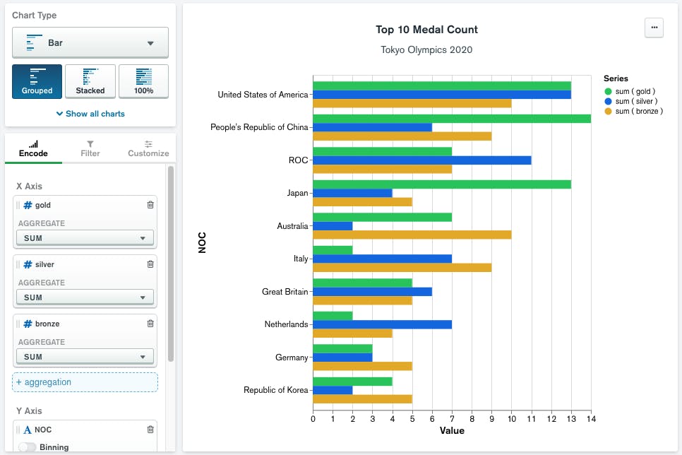
In the above chart, I have a medal tally of the top 10 countries based on medal count. The chart itself is fine, but we could improve this chart with some useful colouring! A notable colour scheme we could apply to this chart is assigning each series to the colour of the medal.

Inside the Color Palette customisation option, you will see that each encoded field is now listed based on the order that they were encoded in. With the colour scheme set to the medal colour, the chart will be a lot easier to convey the original information. Colours assigned to these channels will always have the same colour assigned and will ignore the ordering of these fields.
Assigning chart colours to string data
The final chart that we want to create, involves a chart where the data itself is a String type. With these chart types, the Color Palette will provide options to toggle between the two different colour assignment strategies where:
- 'By Order' will allow you to assign colours by the ordering of the series
- 'By Series' lets you customise the colour for a specific series value

To help streamline the process of assigning colours in the above chart, in the ‘By Order’ menu, I can choose to assign colours based on the value order of the Discipline that appears in the chart. This may be useful if we don't care what the colours are that represent each Discipline. Alternatively, we could assign colours using 'By Series' so that we can be assured that I can represent the Disciplines with an associated colour.

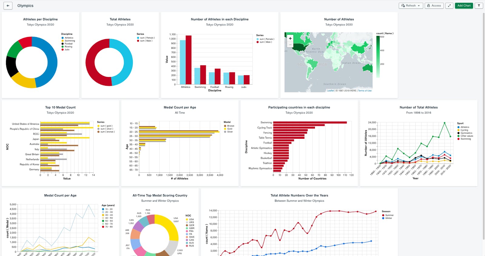
Now that we have created all of our charts using the different ways we can assign colours, we can be confident that the colours in our data visualisations are consistent throughout our dashboard.
Want to start colouring your charts today? You can start now for free by signing up for MongoDB Atlas, deploying a free tier cluster and activating Charts. Have an idea on how we can make MongoDB Charts better? Feel free to leave an idea at the MongoDB Feedback Engine.