We’re excited to announce that MongoDB Charts supports Atlas Data Lake as a data source! You can now use Charts to easily visualize data stored across different Atlas databases and AWS S3 buckets. Thanks to the aggregating power of Atlas Data Lake’s federated query, creating charts and graphs from blended application and cloud object data is simpler than ever before.
On the surface this powerful integration is as simple as adding your Atlas Data Lake as a data source within Charts. However, it unlocks a deeper level of analysis while eliminating the need for creating an Extract-Transform-Load (ETL) process across your Atlas and S3 data.
The integration provides the ability to visualize data from the following combination of sources without writing any code:
- Data from many Atlas databases or clusters, including multi-cloud clusters
- Cloud storage data from AWS S3
- Blended Atlas and cloud storage (AWS S3) data
Scenario: Finding insights from aggregated customer profile and contract data
Let’s add a real world scenario of how this can enhance the analytics you derive from your data. While doing so, we will walk through the steps of setting up your Atlas Data Lake, adding it as a data source to Charts, and getting the most of your data with Charts’ powerful visualization capabilities.
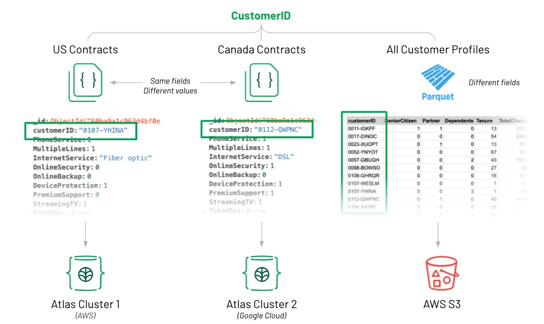
For context, let’s imagine we’re an analyst at a telecom company and we have contract data that is stored in MongoDB Atlas in different clusters and databases for each country we operate in - United States and Canada. Second, we have offloaded data from our Customer Relationship Management (CRM) tool as a parquet file into an AWS S3 bucket. All three datasets share a common “customerID” field.
Clik here to view.

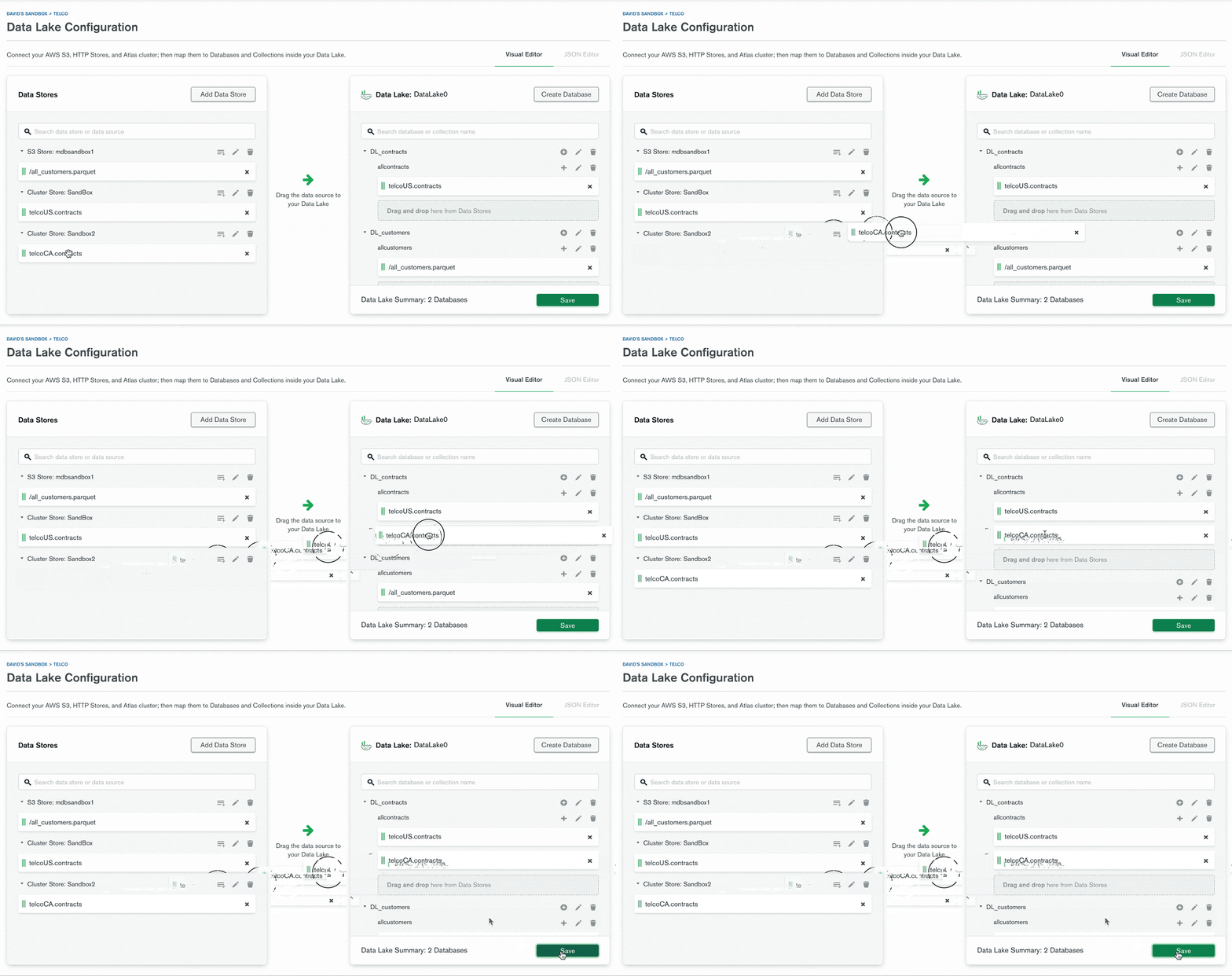
Configure Atlas Data Lake
Because both “contracts” collections (or datasets) in MongoDB Atlas share the same fields, I simply mapped both into a single collection within the data lake. I mapped the customer profiles dataset into its own collection, since it only shares the “customerID” field. However, now that it’s in the same data lake, I will easily be able to join it to my contract data with a $lookup in my Charts aggregation pipeline or with a Lookup Field in the chart builder. (A $lookup in the MongoDB Query API is equivalent to a join in SQL.)
Clik here to view.

Configure Charts data source
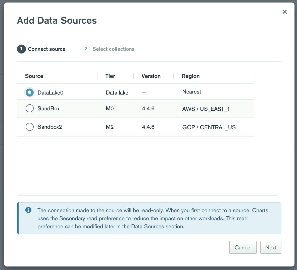
I want to find insights from all contracts, both US and Canada in this scenario. Once I have created a single Atlas Data Lake collection (DL_contracts.allcontracts) from the two separate databases, I then need to add it as a data source in Charts.
Simply click on “add data source” within Charts and add your data lake, and then choose the collections we want to use in the next step. For completeness I also added the two Atlas collections (US and Canada contracts) as data sources in Charts by following the same steps.
Clik here to view.

Visualize data across multiple Atlas databases
With Atlas Data Lake’s federated query capability, which effectively performs a union of data, I am able to build a column chart that shows the amount of all US and CA contracts in a single chart without writing any code. As you can see below, the chart shows both US and CA columns when connected to the data lake collection. When the data source is switched directly to either Atlas database, it only shows data for that respective database, or country in this example.
Clik here to view.

Visualize blended data from Atlas and an AWS S3 bucket
Lastly, let’s take our insights to the next level by visualizing data from multiple Atlas databases and a parquet file that’s stored in an AWS S3 bucket. Adding customer profile data that I offloaded from my CRM tool into S3 will enable me to find more robust insights. I could also visualize the data from the parquet file alone by connecting to that data lake collection.
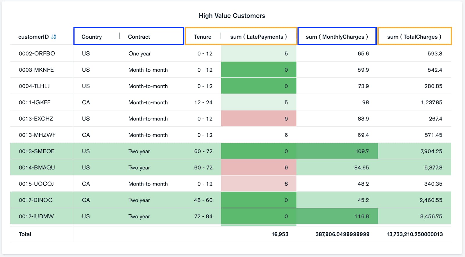
Since the contract data and customer profile data are in different collections within my Atlas Data Lake, I created a $lookup in the aggregation pipeline of the Charts data source. I then created a table chart from three different data sources with conditional formatting to quickly identify high value customers. The columns with blue boxes include contract data from both Atlas clusters, while the columns with orange boxes include customer profile data from a parquet file via AWS S3 bucket.
Clik here to view.

Note, I could also aggregate the data in Atlas Data Lake and use $out to create a new collection of the data, and then connect Charts to the new collection as a data source. For the purposes of this blog, I wanted to highlight Charts-specific aggregation capabilities.
We hope that you’re excited about the ability to easily visualize multiple data sources, from multiple Atlas databases to AWS S3 buckets in one place! Remember, if you haven’t used Charts before, you can get started for free by signing up for MongoDB Cloud, deploying an Atlas cluster and activating Charts.